Adjusting the Responsive Layout of your Tour
Last updated: August 31, 2026
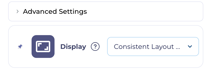
In the Tour-Wide Settings in Tour Builder, you can use the Display option to choose how your tour will render across various screen sizes. Two options are available, as follows.
Consistent Layout
This is our default and recommended option. The original layout of your captured page will be preserved. The entire page and all elements in it will scale up or down proportionally to the original width of your captured viewport.
This will stop any responsive repositioning of any elements from your captured page. Viewers will not see any elements in a different position or cut off if their monitor size differs from the sizes of the pages when originally captured.
We recommend using this option because it allows any viewers to see the pages exactly as the tour creator intended, with no surprises if they open it on a smaller or larger screen. If the viewer has a window size that exceeds the width of the originally captured page, the tour will remain centered on the screen. This also applies to fullscreen if the viewer has a larger screen than the original pages.
The consistent view works best on tours captured with extension version 2.0.179 or higher.
Tours captured in previous versions can be also enabled with this option. Saleo recommends giving the tours a test view before sharing to ensure compatibility with the pages on older tours.
Adapt to Screen Size
This option will allow the responsive elements of the captured pages to adapt depending on the destination screen size. Using this option will allow the pages to behave like the original app where possible.
Tips for Display Settings
Which option should I use?
In most cases, Saleo recommends using the consistent layout option. This ensures your tour has the same appearance across many devices. The adapt option can be useful if you wish to show off certain functionalities of your application or are showing the tour in a situation where you know the screen size will be appropriate for the product pages shown.
Which elements on a tour pages are responsive?
Saleo will capture as many responsive behaviors as possible when a new page is captured. Depending on the native application, this may not always be possible to capture in every situation. For example, a page may have a side navigation menu that collapses or expands depending on the screen width. This functionality could be executed with code that was not captured, so the menu may not look correct if you view it on a screen size that does not match the original. This variability is why we recommend the consistent setting. This takes out the guesswork of how the final tour will appear.